
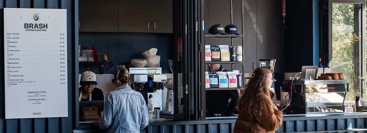
Project: Brash Coffee Brand Ecosystem
Role: Art Director & Designer
Deliverables: Visual Identity, Packaging Architecture, & Digital Content

The Challenge
Brash Coffee needed a refined, authoritative visual system to elevate its local cult-following into a premium lifestyle brand, requiring an identity that mirrored the meticulous, uncompromised quality of its product.
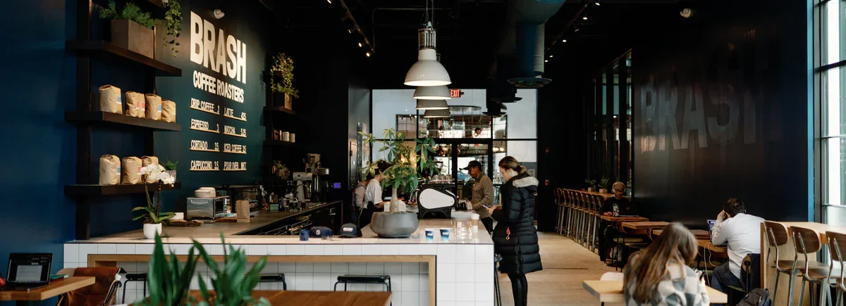
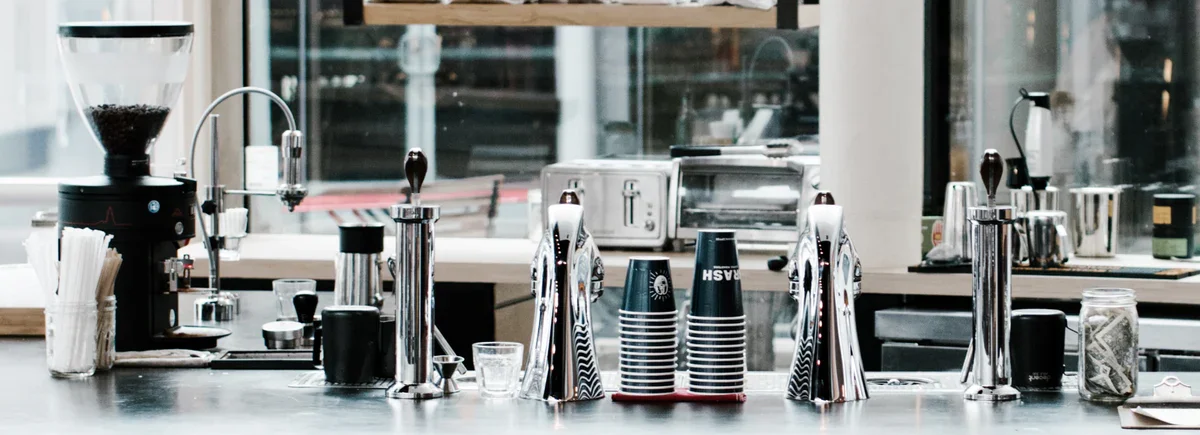
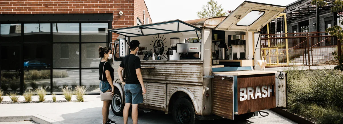
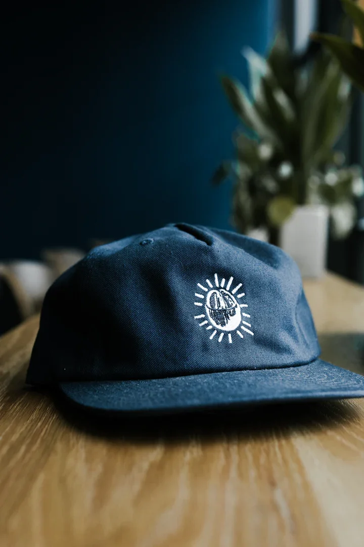
The Solution
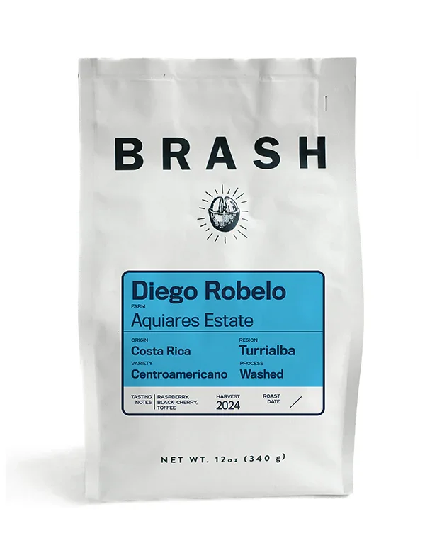
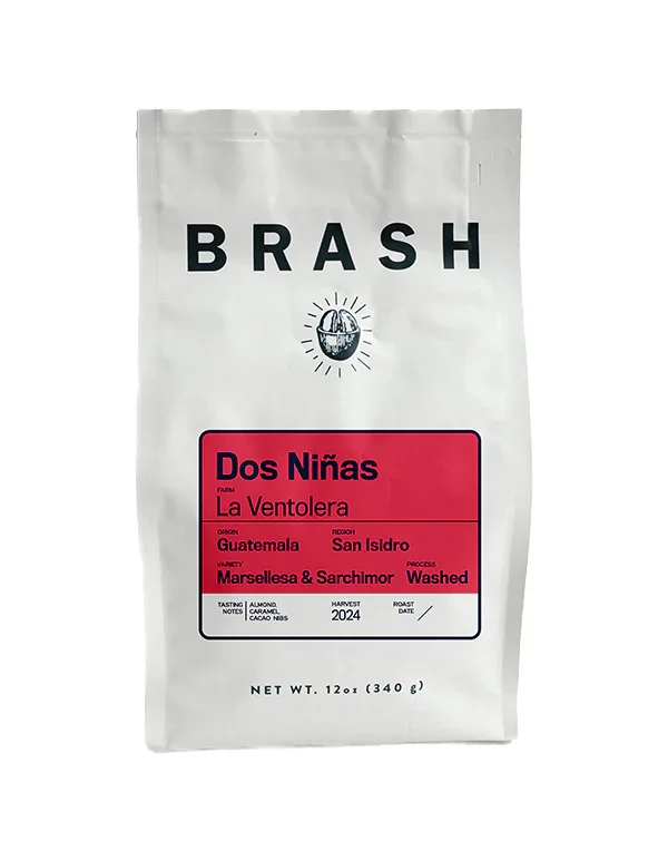
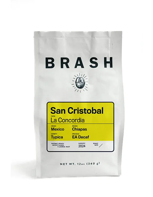
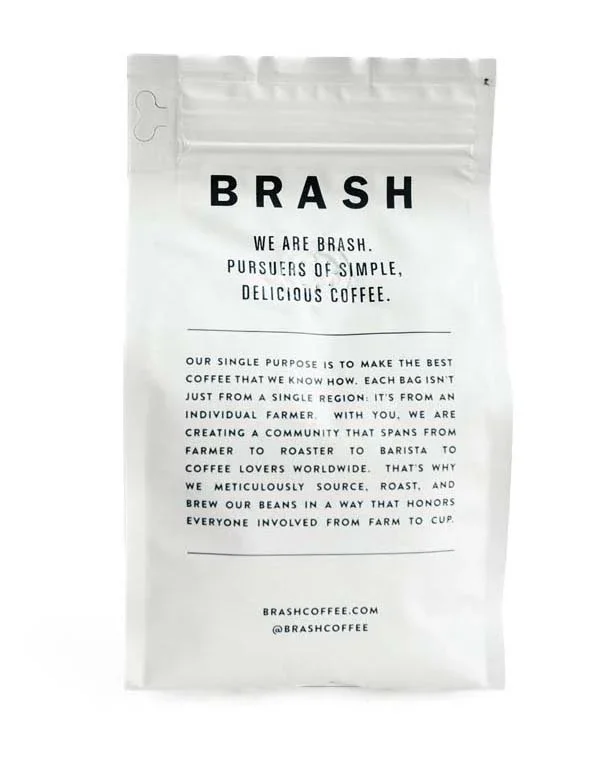
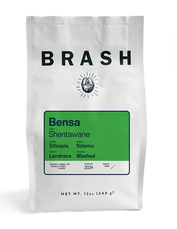
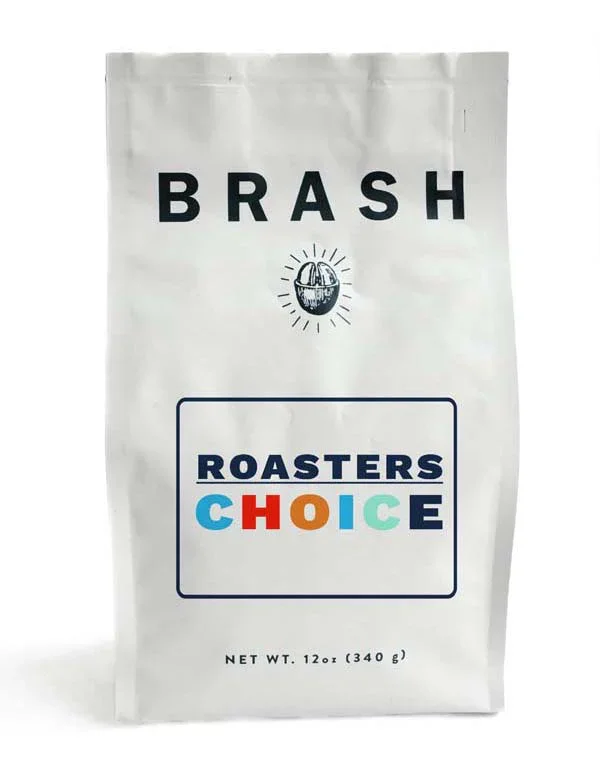
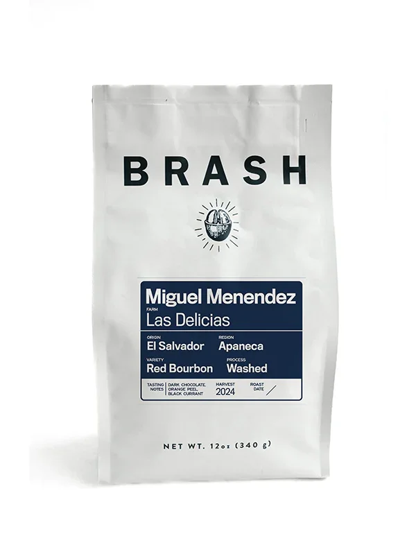
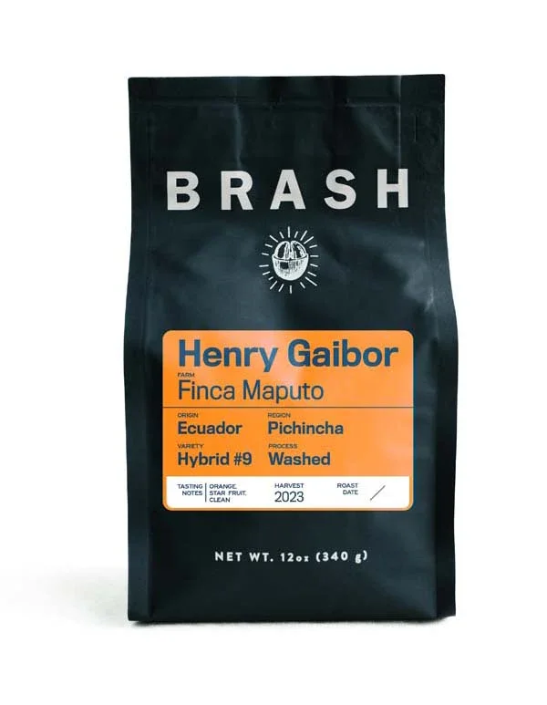
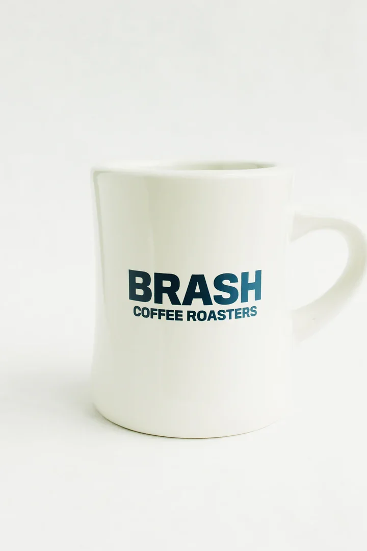
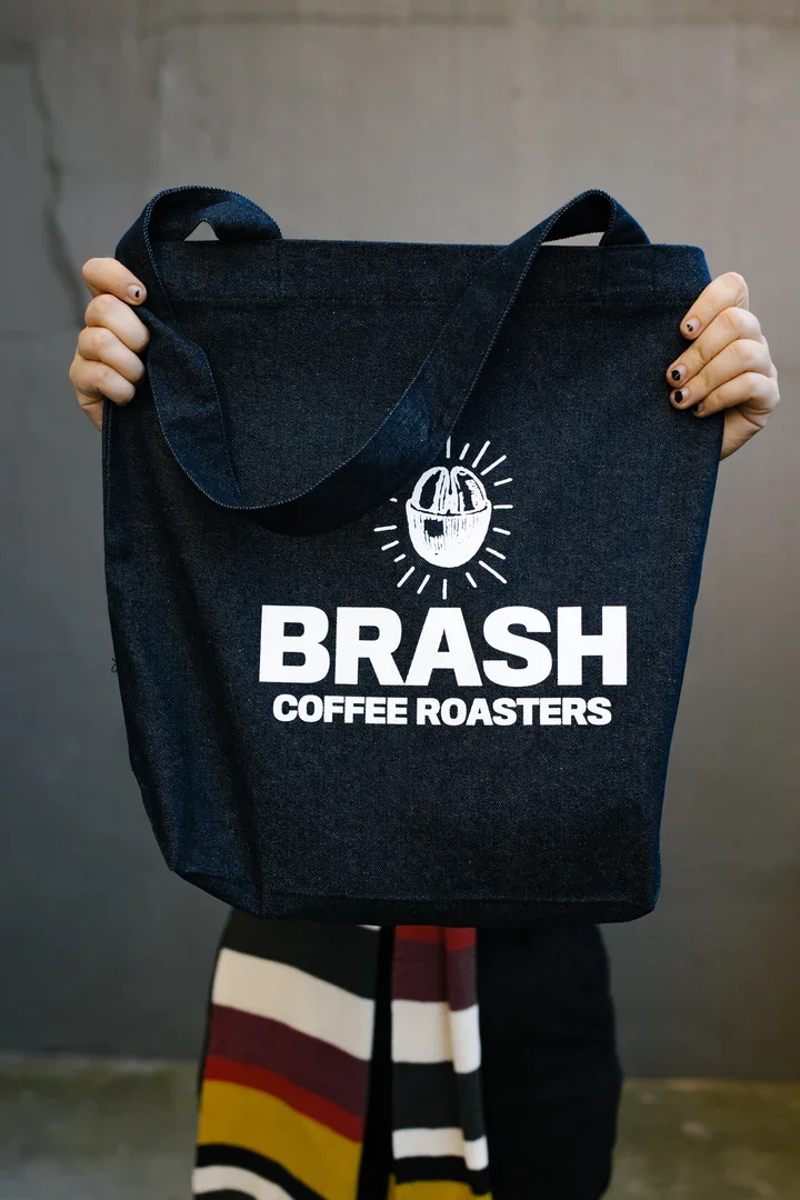
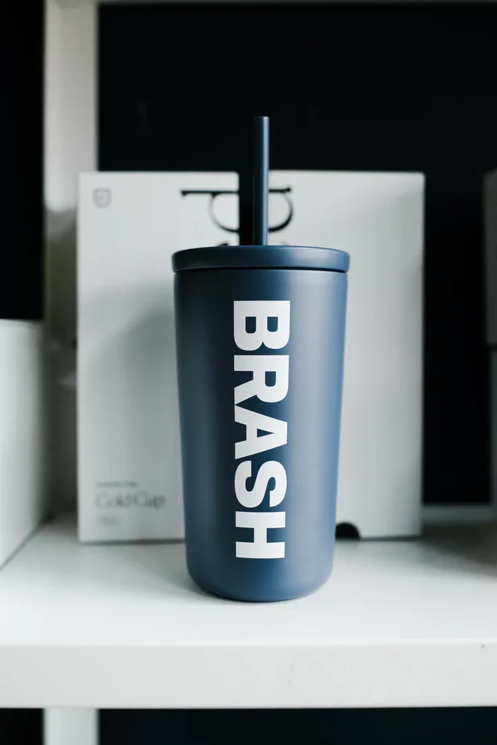
We engineered a striking, minimalist packaging architecture that puts the product's origin story at the forefront. By highlighting the specific farmer, farm name, elevation, and regional origin directly on the label face, the design frames each small batch as a premium, traceable commodity. This bold creative direction strips away generic cafe design tropes, resulting in a raw, highly authentic product experience that scales seamlessly across retail assets and digital mediums.