
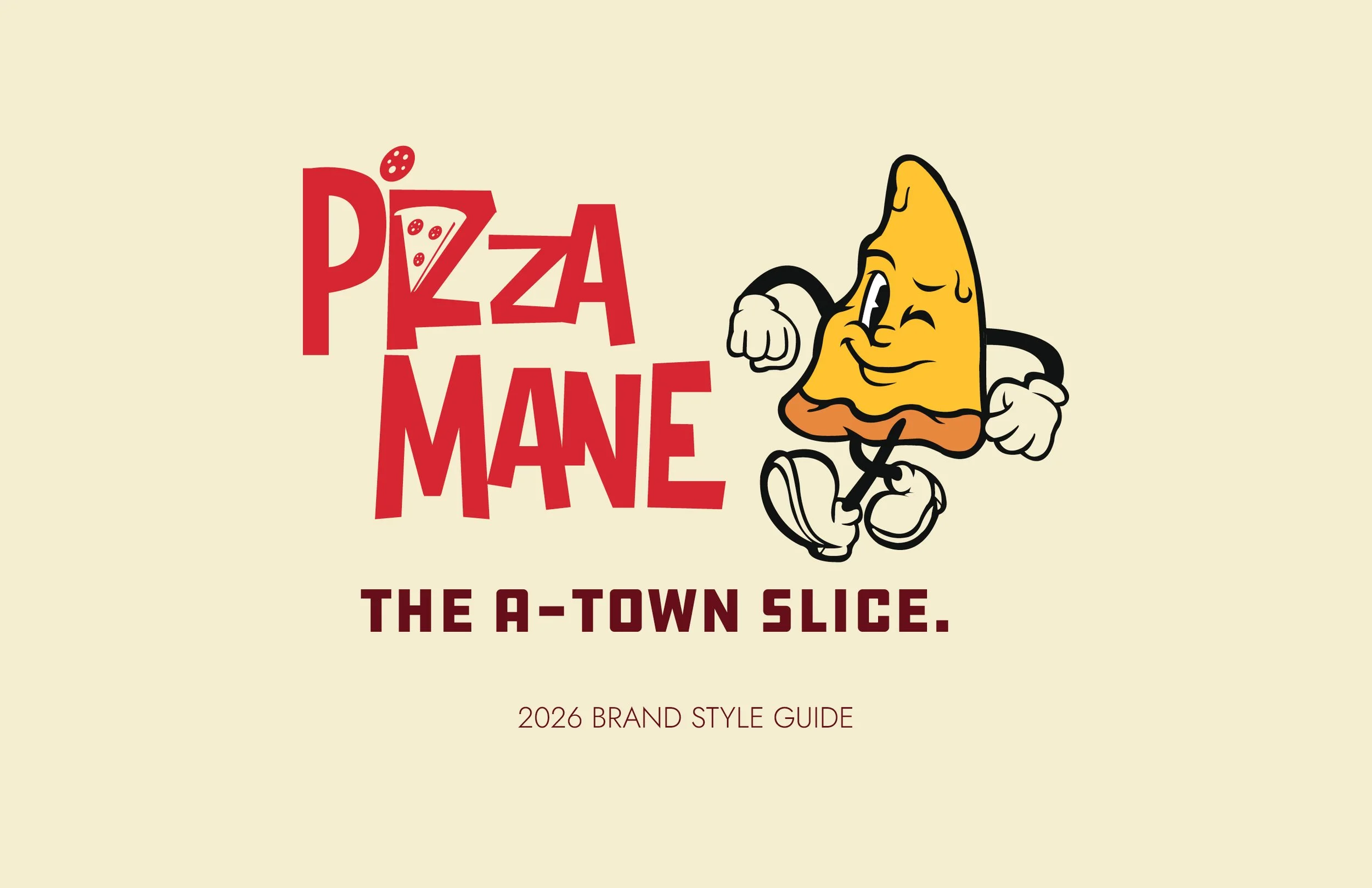
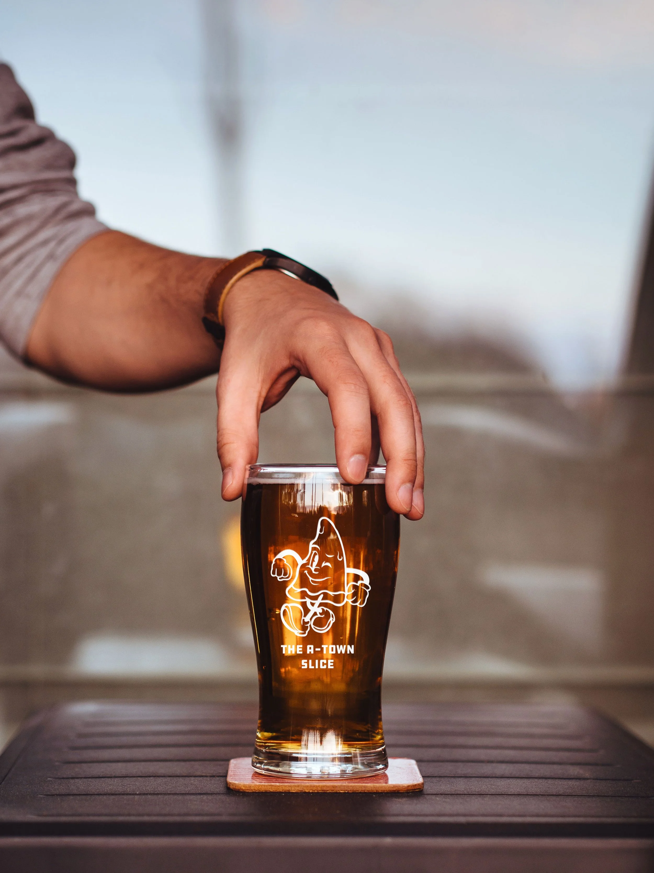
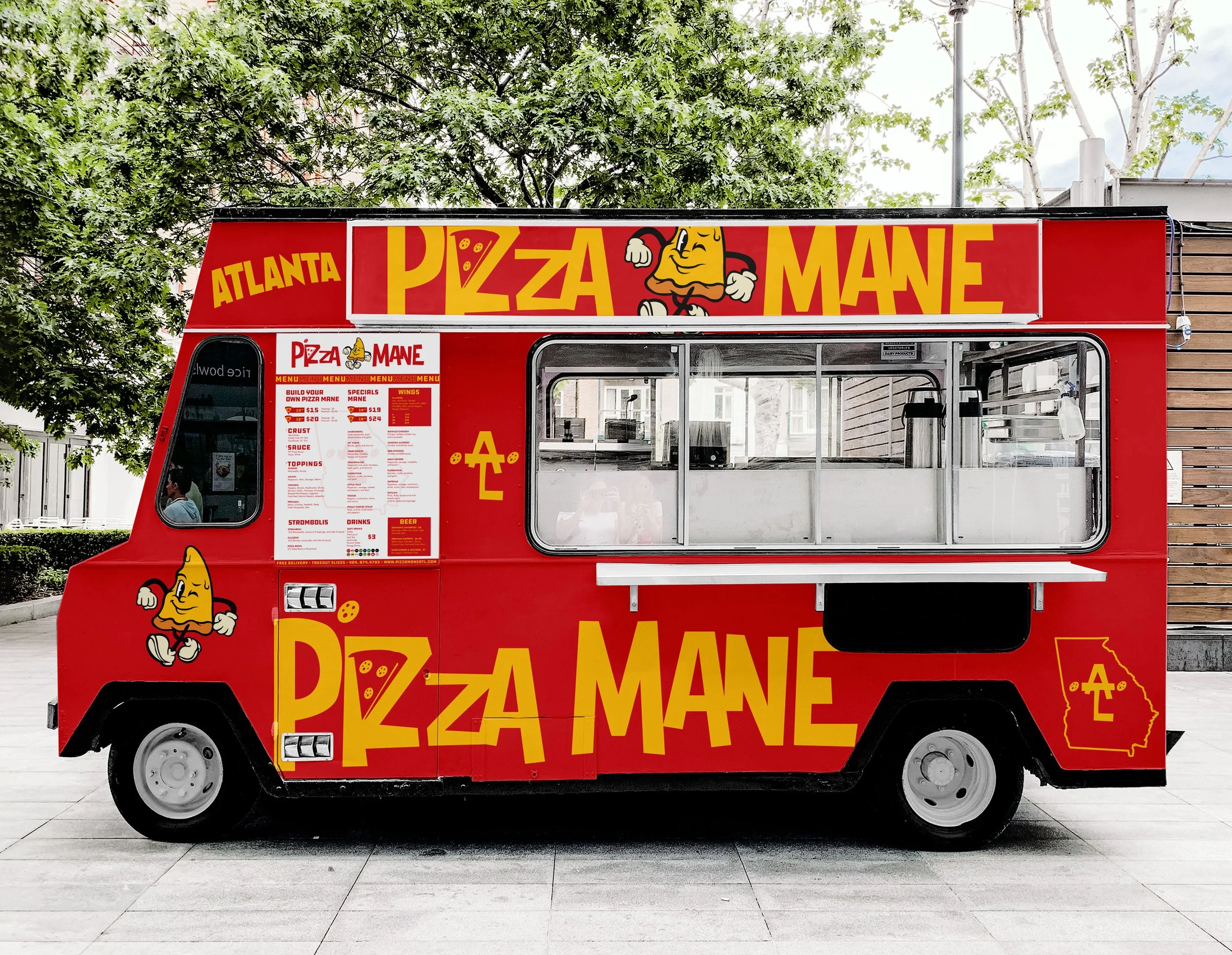
Project: Pizza Mane Identity
Role: Art Director & Designer
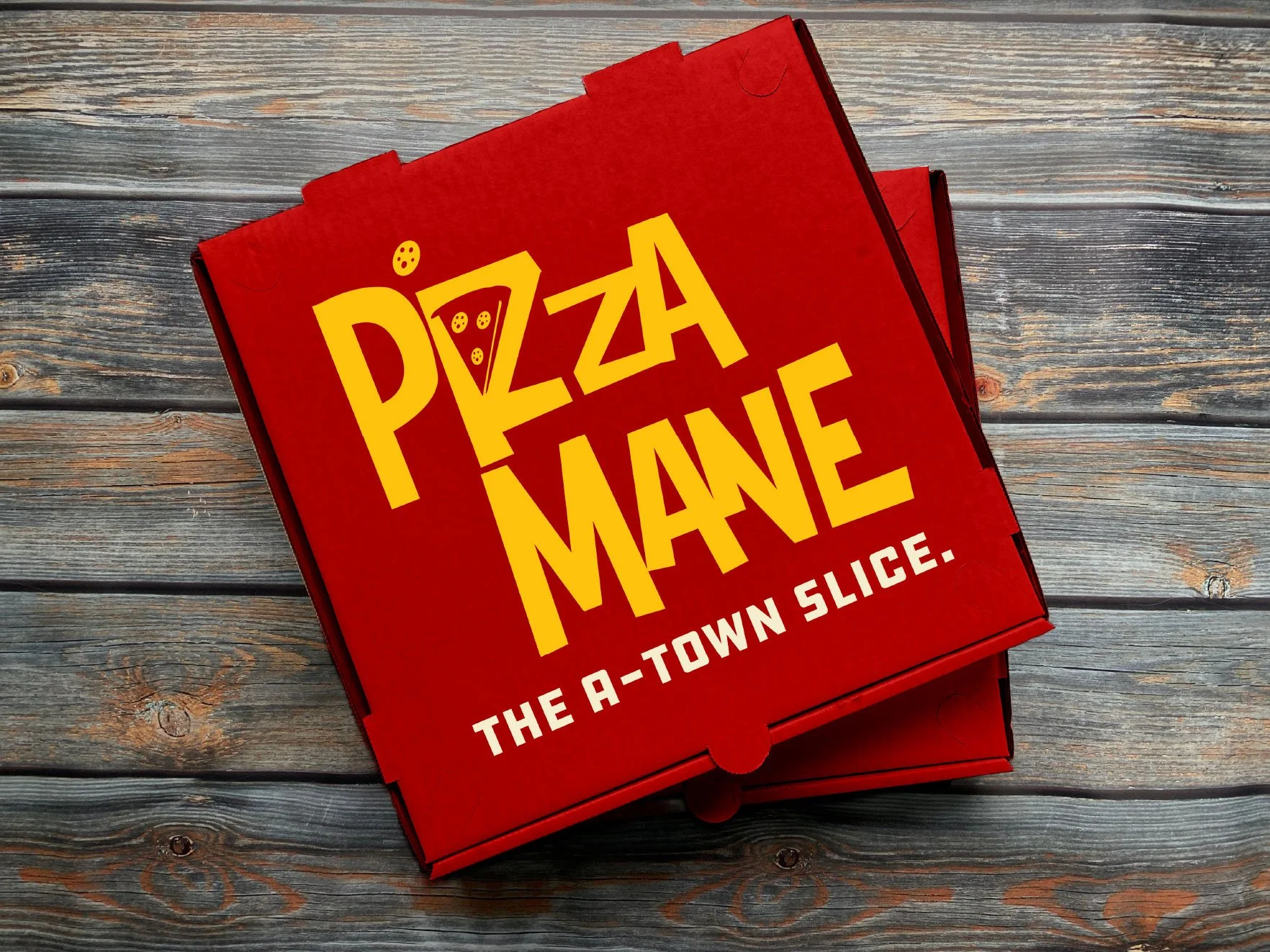
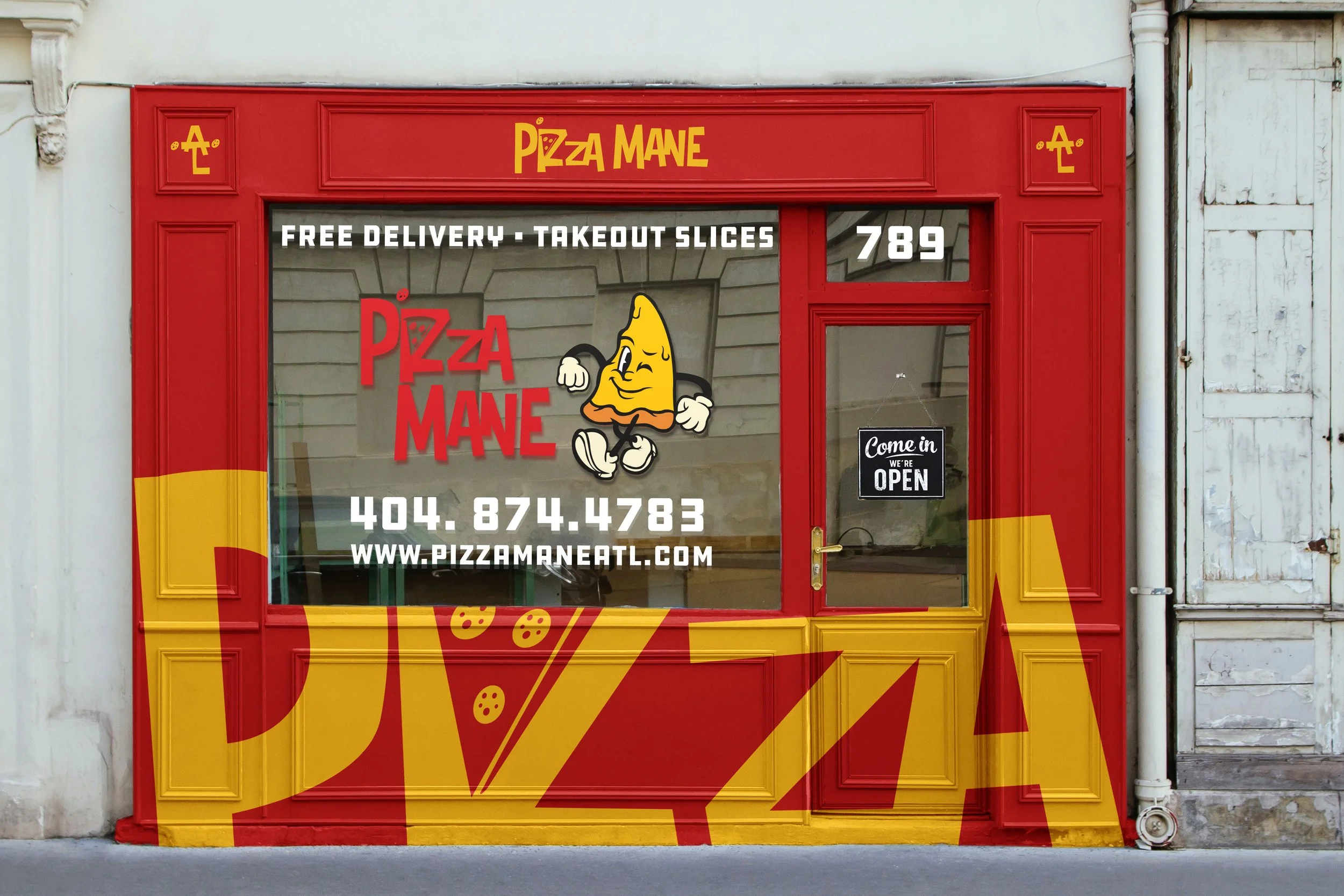
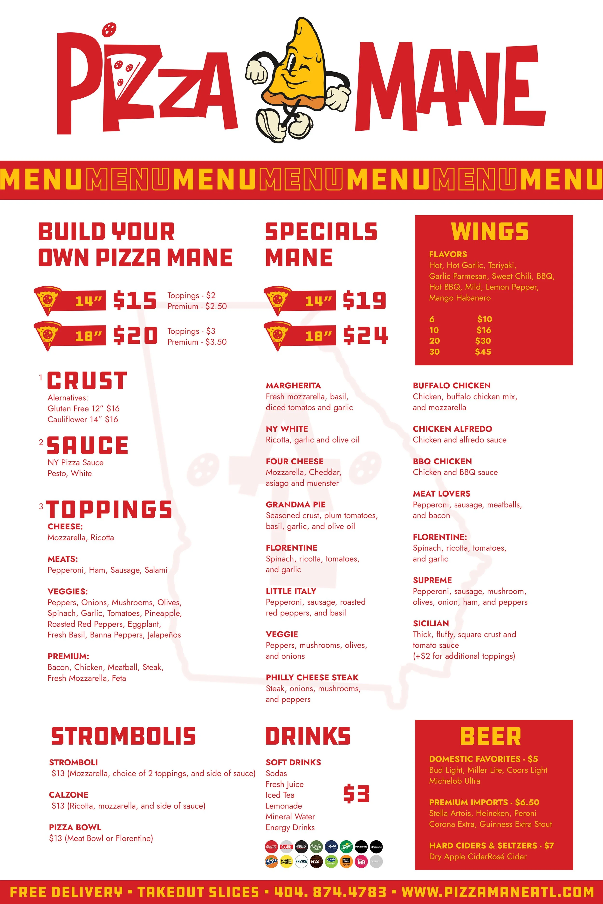
Deliverables: Brand Identity, Packaging Design, & Digital Assets
The Challenge
Pizza Mane needed a bold, memorable identity to cut through a crowded culinary space and establish an immediate, recognizable connection with local food lovers and modern diners.
The Solution
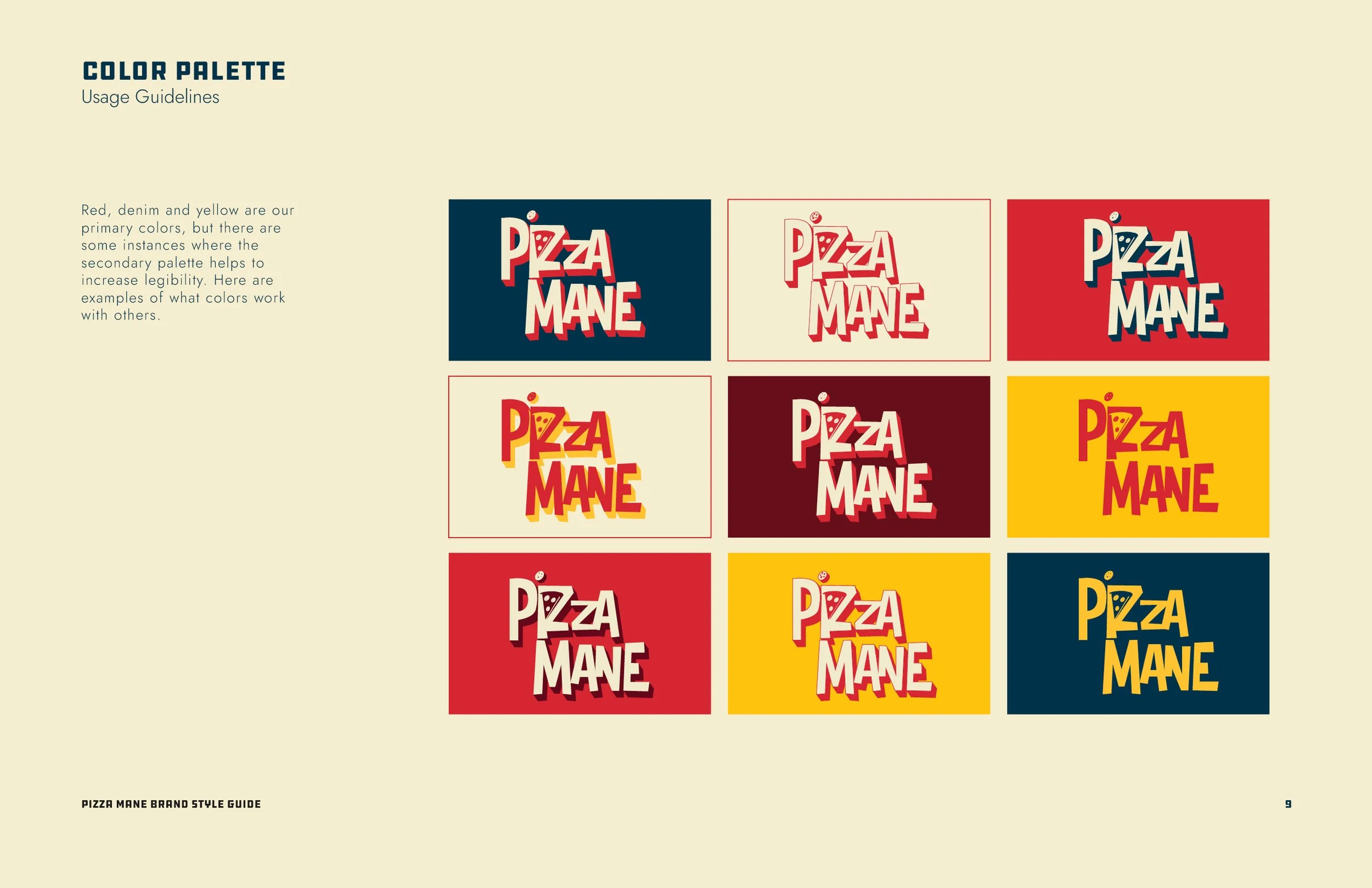
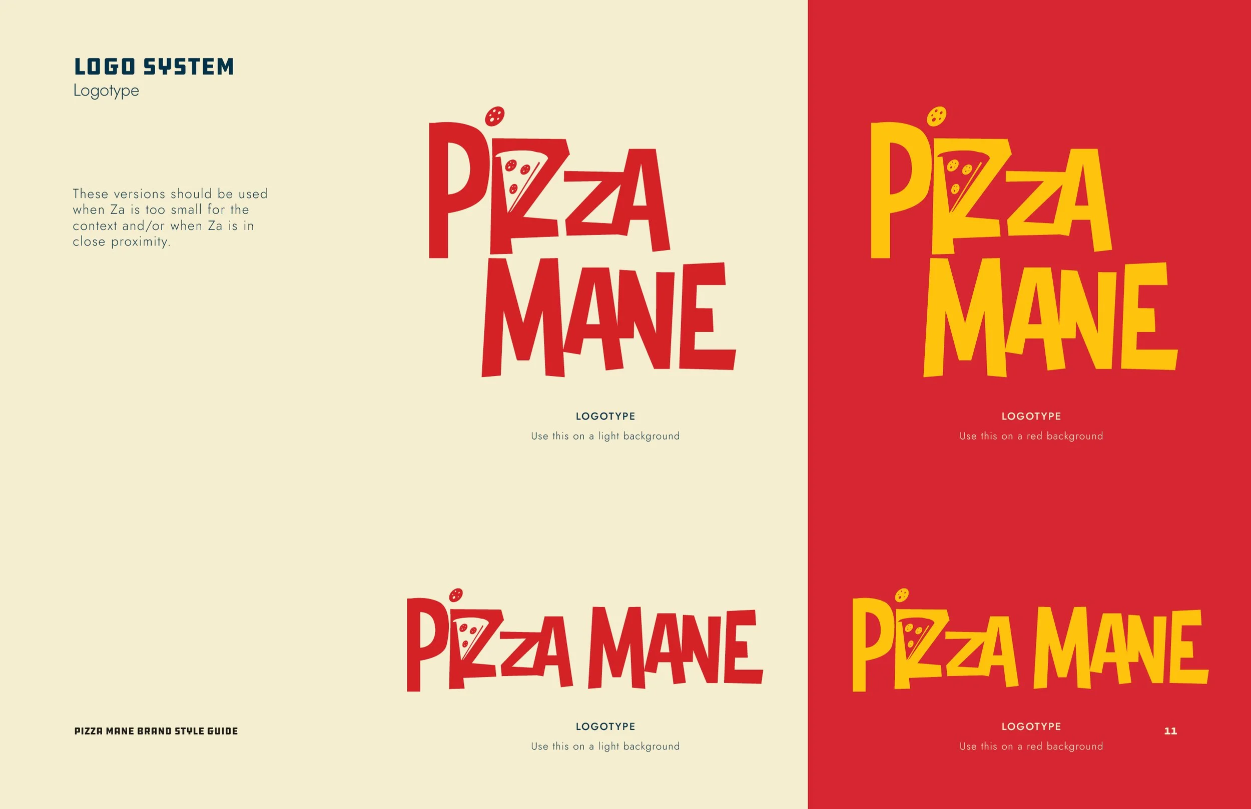
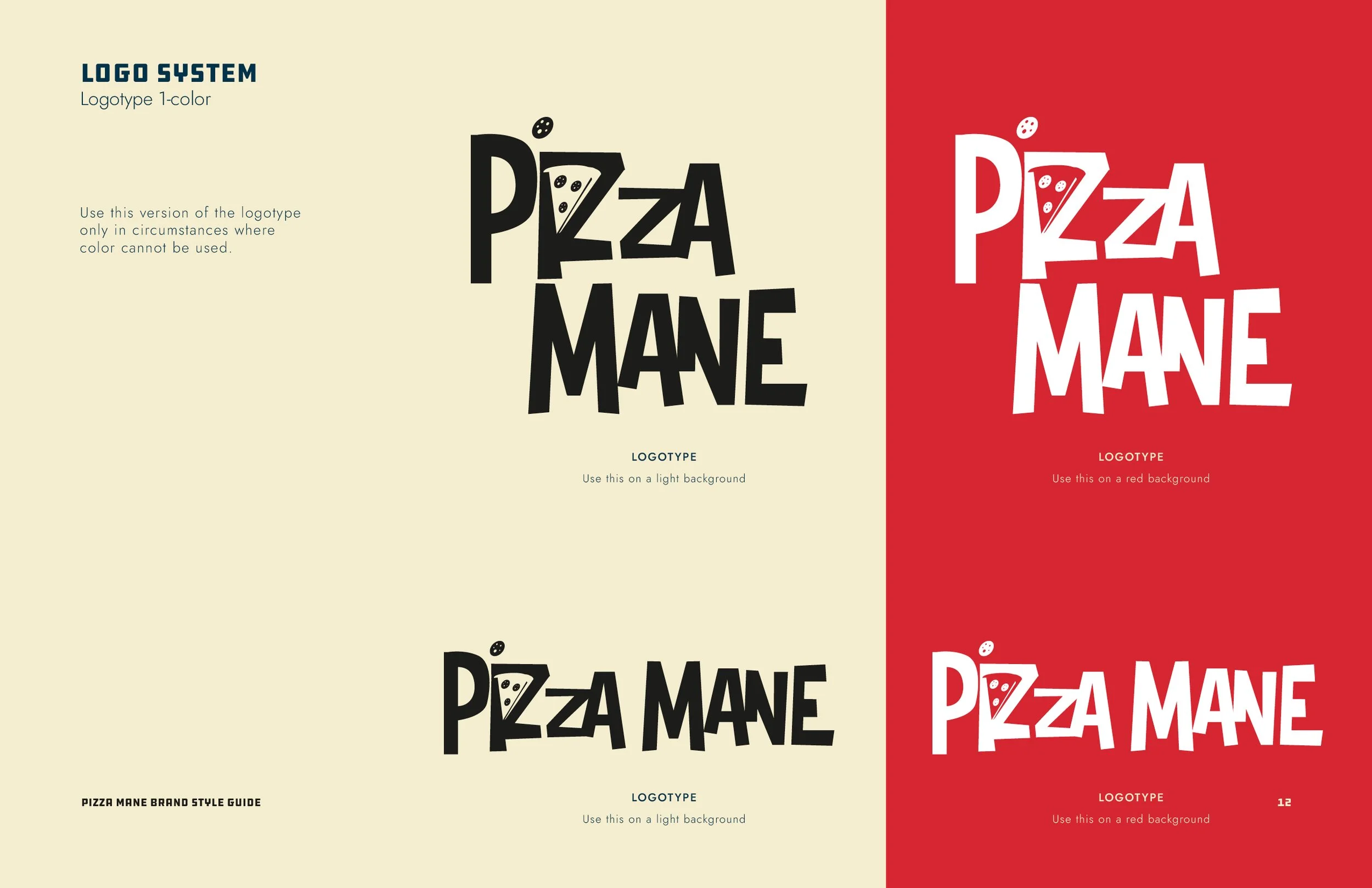
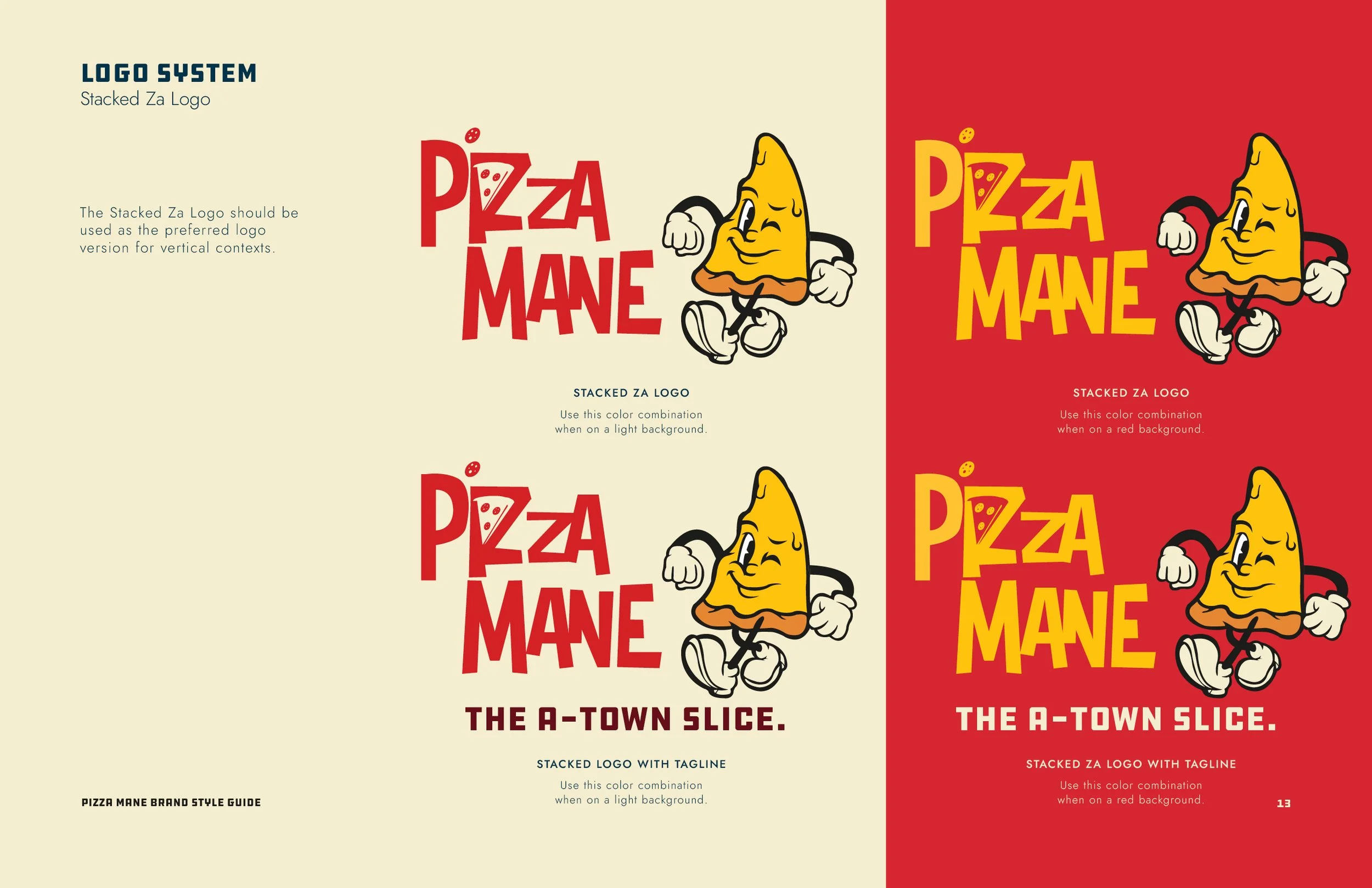
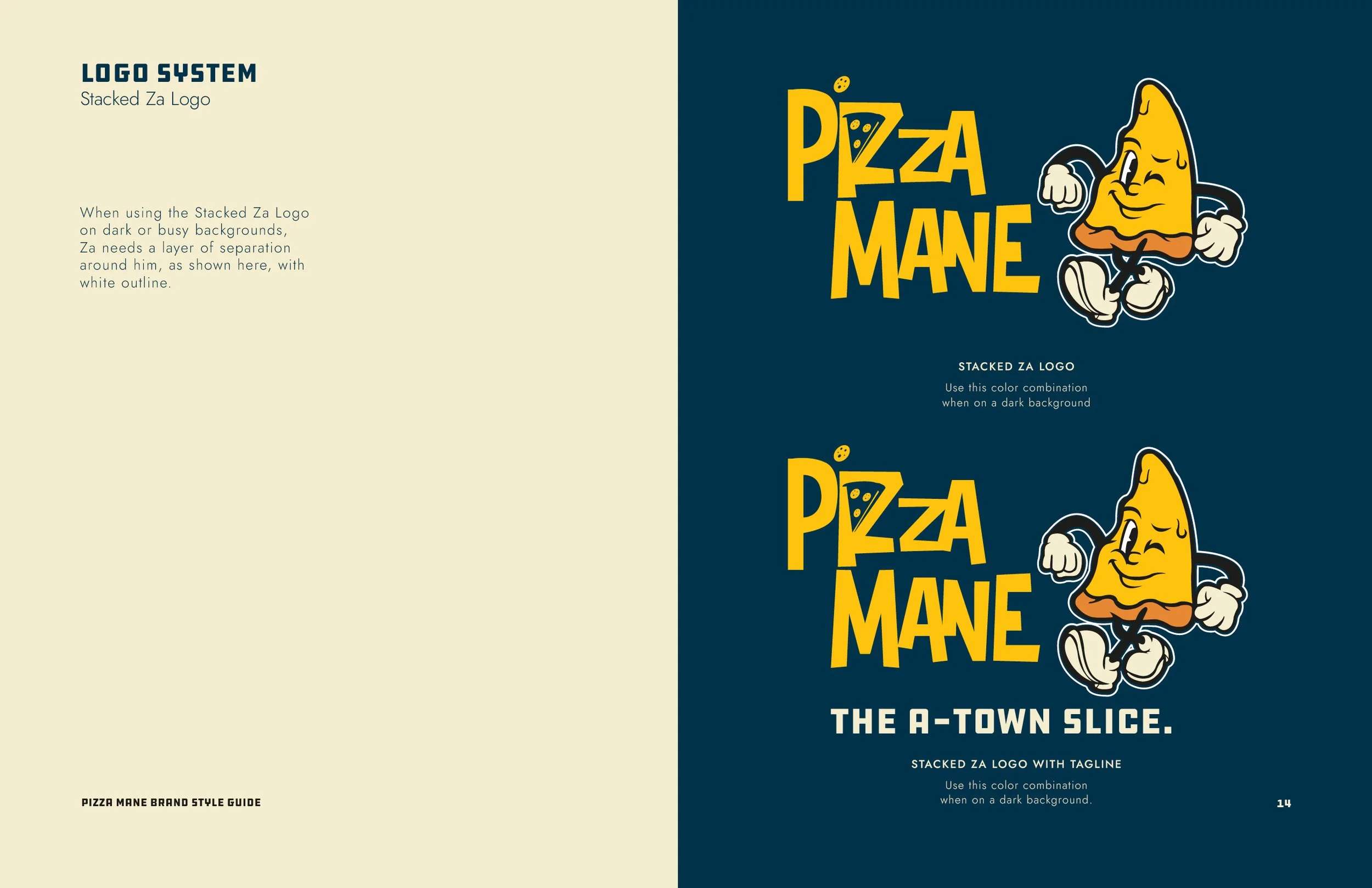
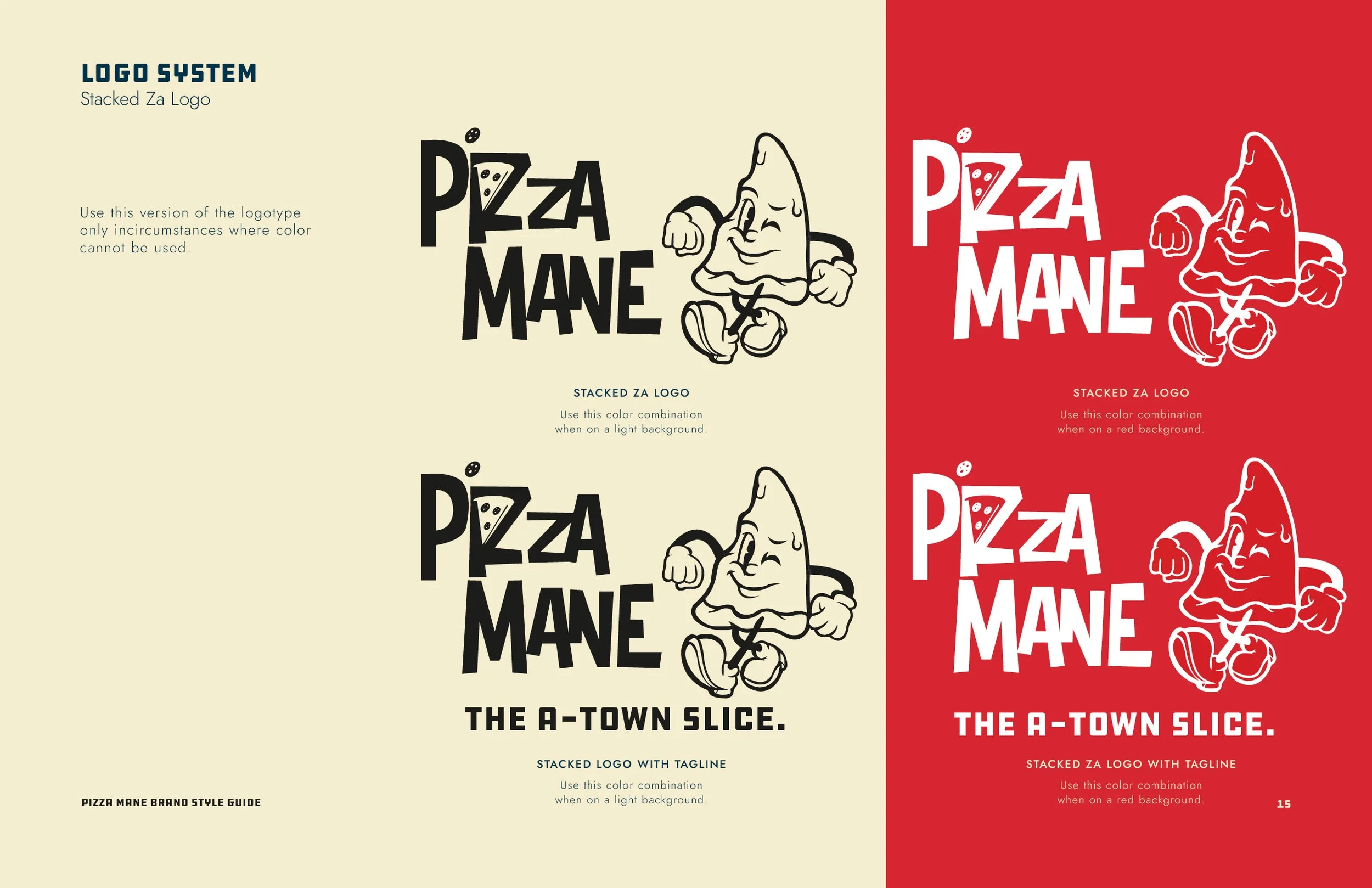
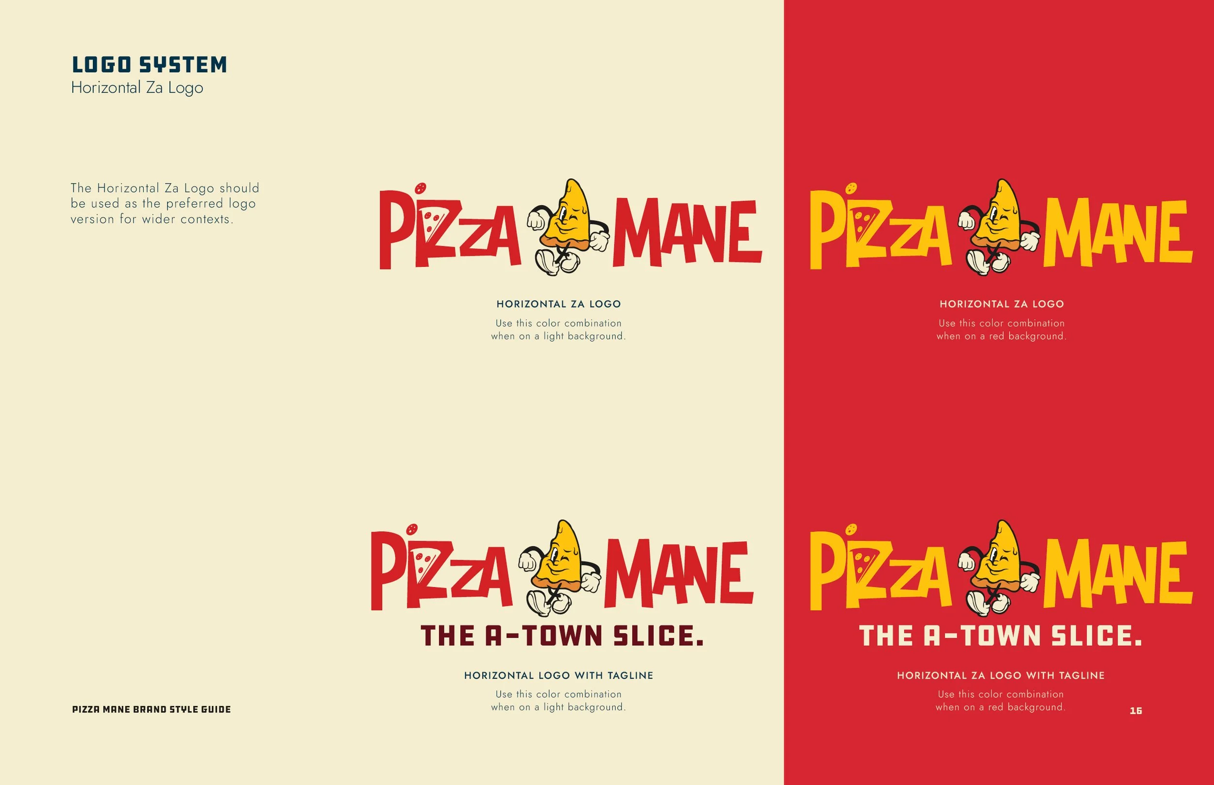
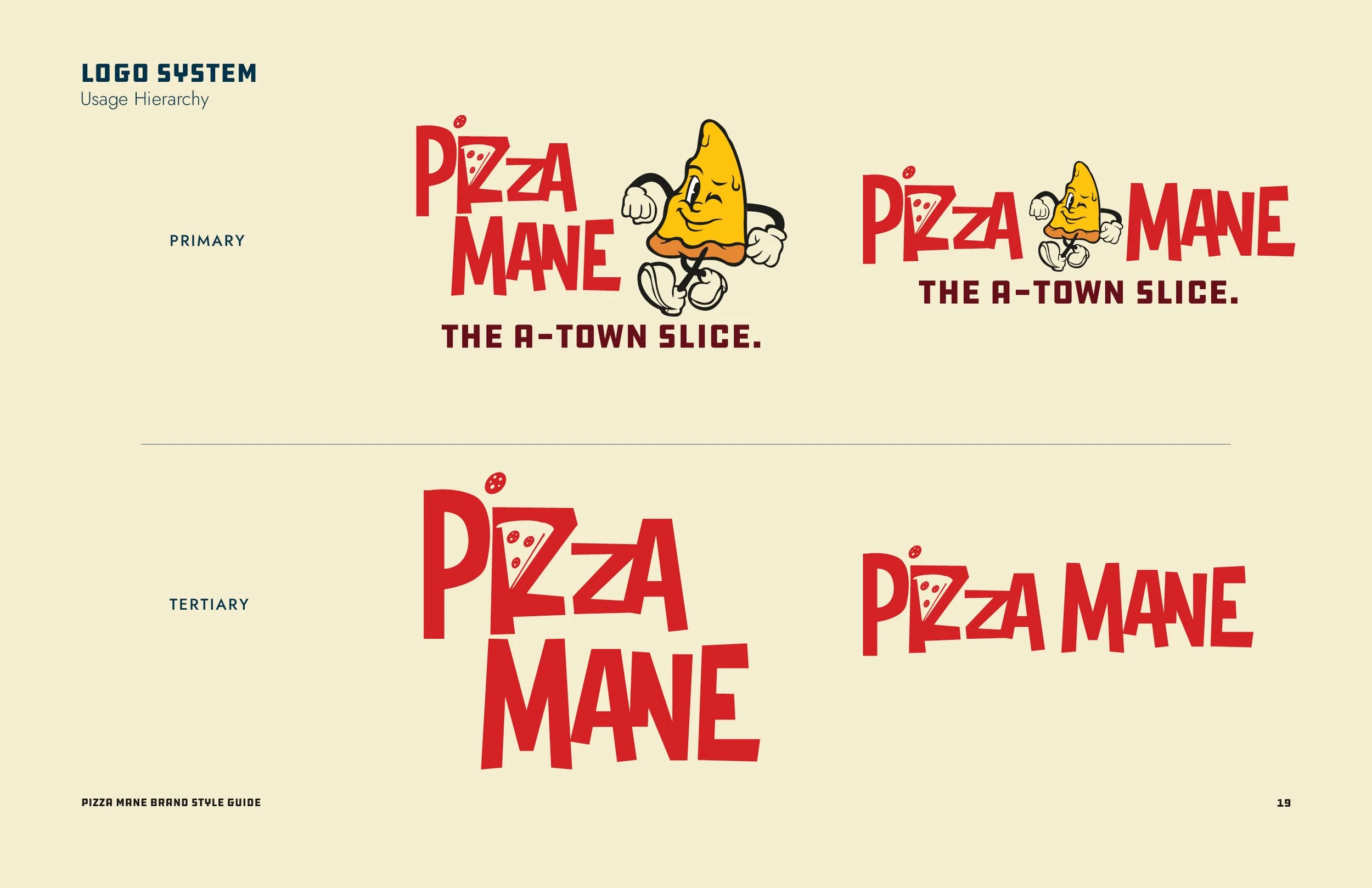
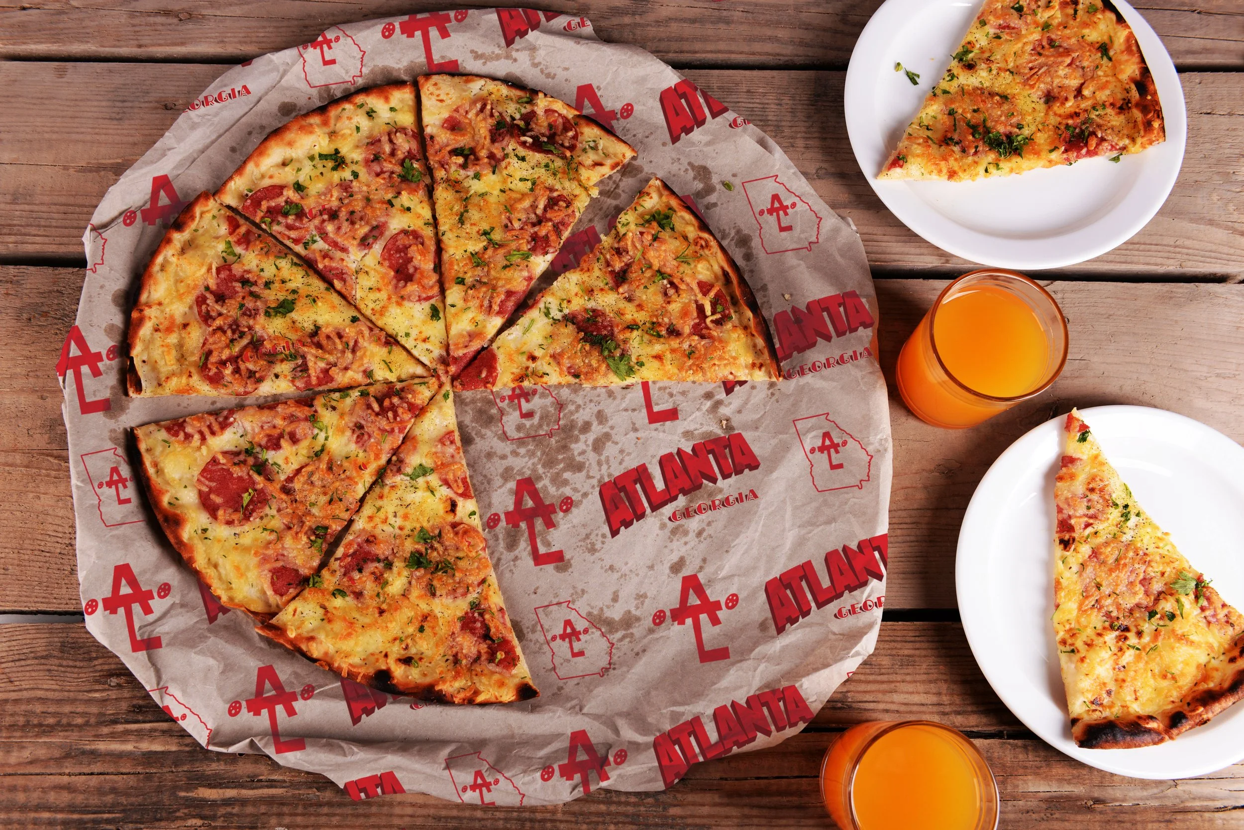
We built a high-energy brand identity using a clean graphic mark paired with a striking, contrast-heavy color palette. The resulting visual system brought a fresh personality to the local dining sector, creating a highly scalable look that translated seamlessly across physical product packaging, custom apparel, and online ordering mediums.